
Narrative Media Class | October-November 2023
“Bound by Flame is a fantasy tabletop role-playing game where players will adventure through a land full of half-beasts, witches, and magical creatures to battle against an ancient evil that threatens the lives of all humanoids in the land.
Using a mixture of collaborative storytelling, various-sided dice, theatre-of-the-mind, and some tabletop assets, players can shape the narrative together and create an exciting story that explores themes of oppression and rebellion”
- Anna Kelemen, Bound by Flame Anyflip page description.
Adapted from the script, “Bound by Flame”, by Taylor Liu and Zak Zastera
Anna Kelemen (Writing, Graphic Design), Navpreet Matharu (Writing, Graphic Design), Denys Panda (Printing + Bookbinding, Additional Illustration)
Figma, Procreate, Inkarnate
(Banner render by Navpreet Matharu)
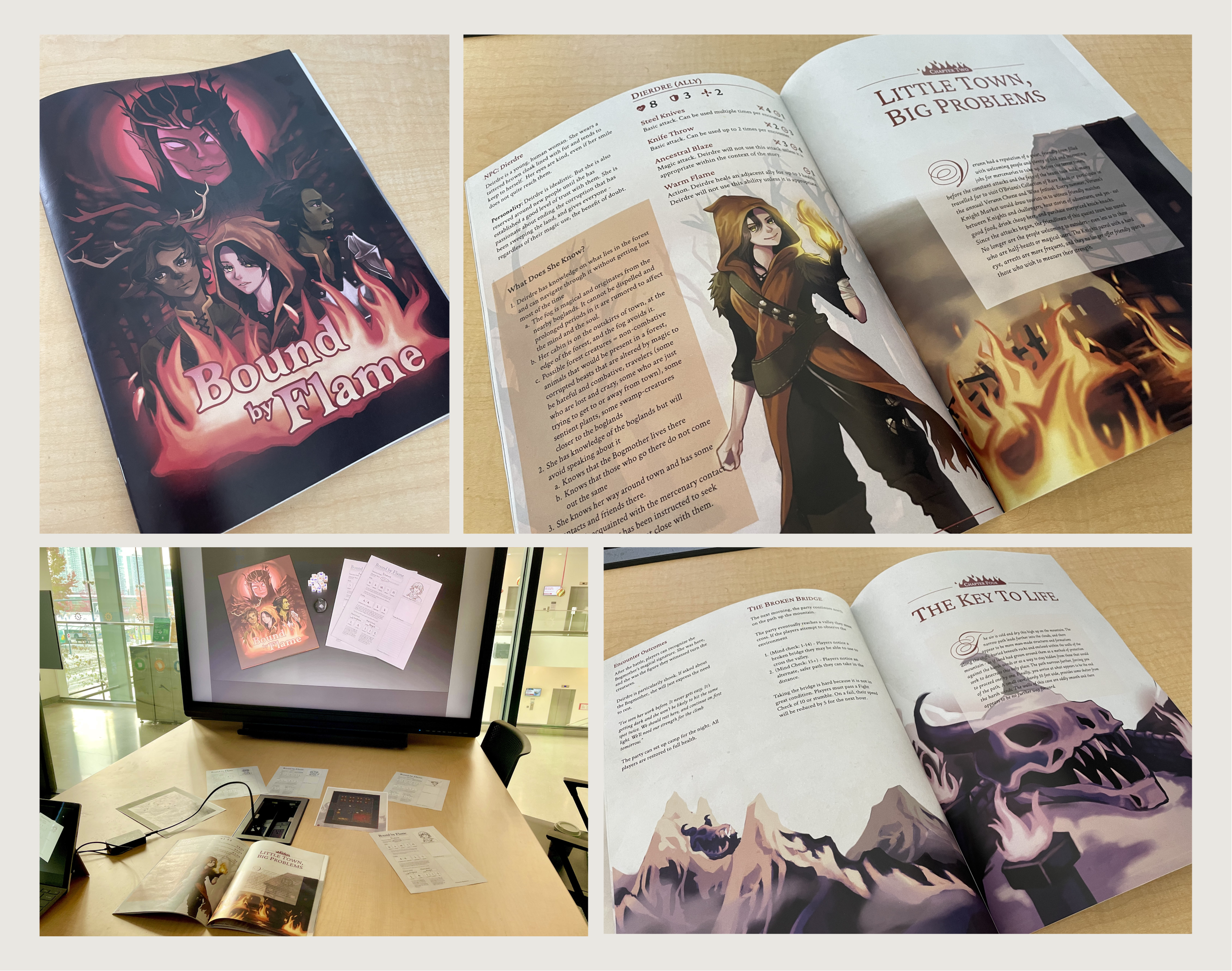
View the full bookOur goal was to adapt the script “Bound by Flame” into a tabletop RPG campaign book. While my teammates oversaw adapting the script into game form which entailed creative writing and game design, I was in charge of the visual aspects of our book, including the overall style, illustration, and creating battle maps.
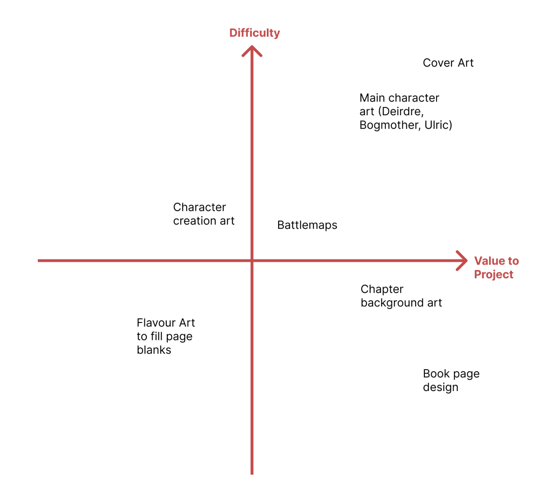
After discussing with my team on how long our book should be and what elements it should include, I created a list of tasks for myself to complete during the duration of the project. Knowing the sheer amount of art I would need to make would be daunting, I arranged them in a matrix of task difficulty vs. how important a task is to the finished project.
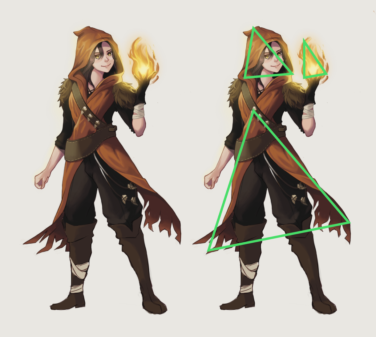
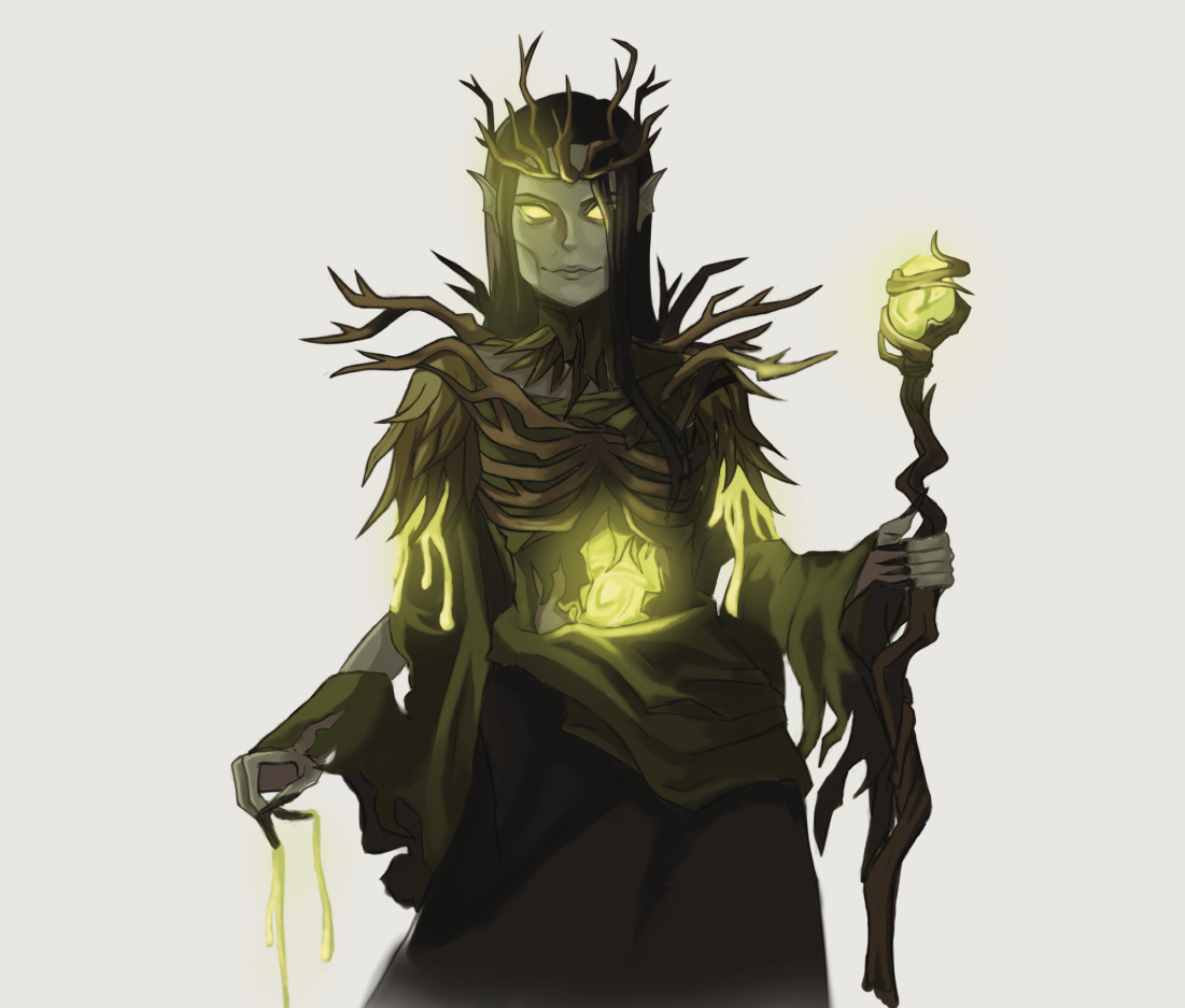
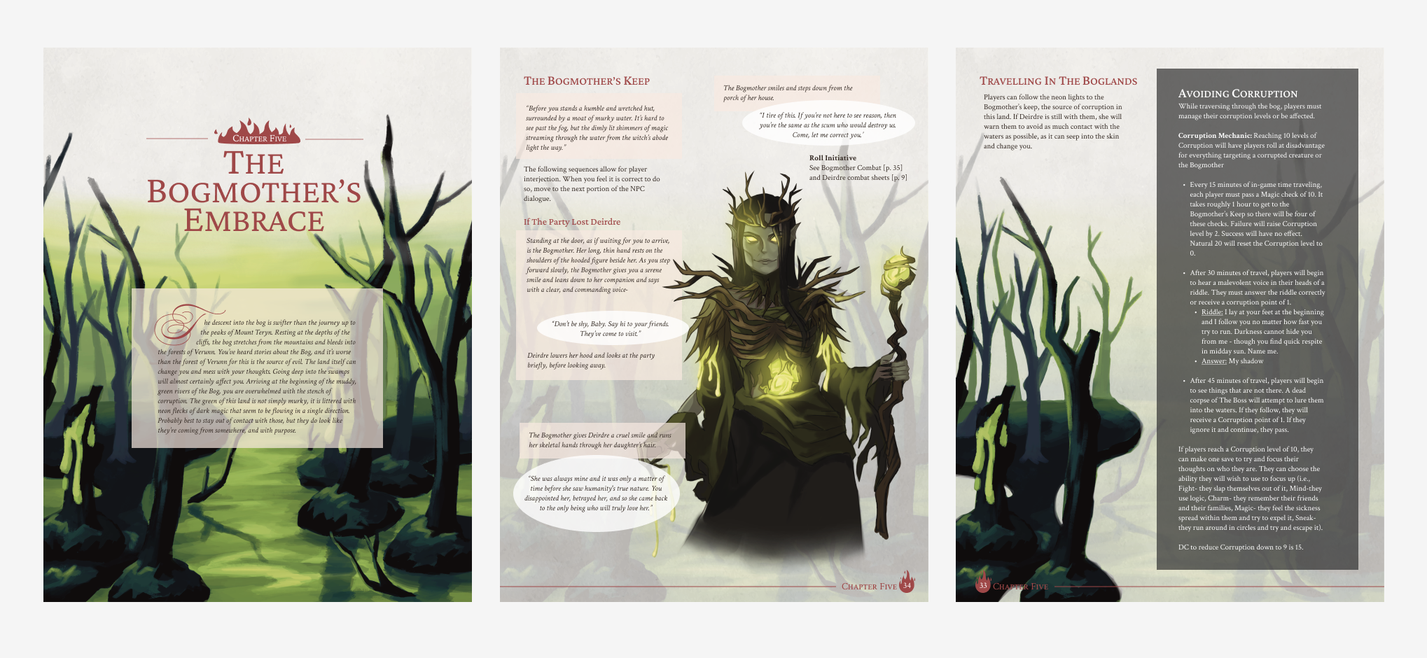
Because our story relied on character writing for players to feel immersed and emotionally moved, I decided the most important pieces to get started on were high-fidelity artwork of Deirdre, the main ally character; and the Bogmother, the antagonist of the campaign.
I considered shape language and colour theory when designing these characters. For example, Deirdre is a forest witch who is crafty and sharp-witted, yet also a compassionate healer. Therefore, I decided she should be mainly represented by triangles, but also have some softer, rounder features. Colour-wise, I went with mainly natural browns and beiges to show that she makes her own gear from material gathered from the forest. Most prominent in her design is her bright-orange cloak, which communicates her fire abilities as well as the mystery to her character that players will uncover throughout the campaign.
I also designed our antagonist, the Bogmother with similar considerations. She is meant to be an ancient swamp queen with magical abilities and evil ambition.
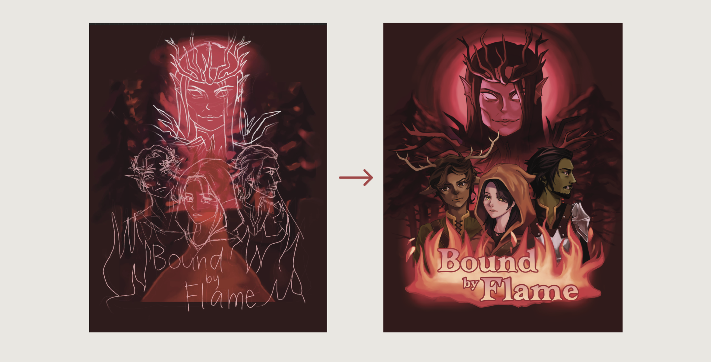
While the cover was not needed until the very end of the project, I had to start on it early, since it would take a very long time. Because this one image would be the first impression everyone would have of our entire project, I really needed to make it polished.
Since our campaign book is a hero’s journey where players go on an epic adventure, I was inspired by posters and key images from popular adventure movies when designing our cover. I found that a good cover for this kind of story is quite formulaic, really: The protagonists are front and center in a spooky environment, and the antagonist blends more into the background— menacingly looming over everyone.
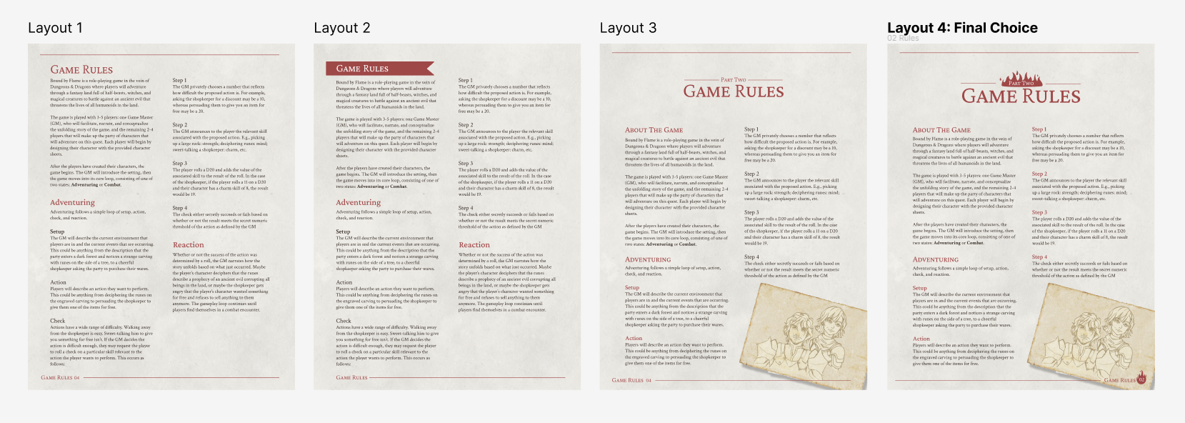
Having read many TTRPG campaign books before, I already had a bit of a vision in my head of what I wanted the style of the book to be. I wanted it to have a rustic, fantasy feel, as well as be uniquely suited to our story. I chose to use a parchment texture for the page background and utilize a warm, muted red as our main accent colour, as it matched the cover design. With those elements, I played around in Figma and continued to iterate on my designs until I came up with one I was pleased with. With this finished example page of how I wanted the headers, footers, and overall style of the book to look like, my teammates could follow this style when putting together the rest of the book.
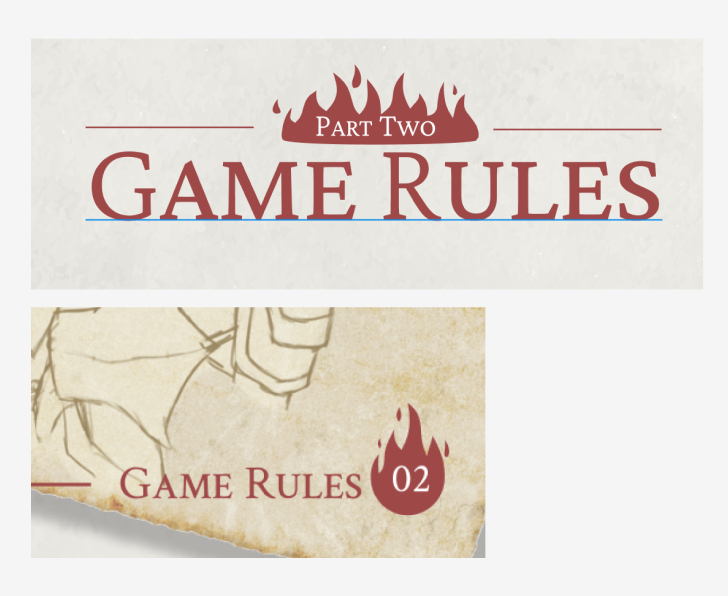
Here are the headers and footers used throughout the book. I drew the flames using Figma’s vector tools.
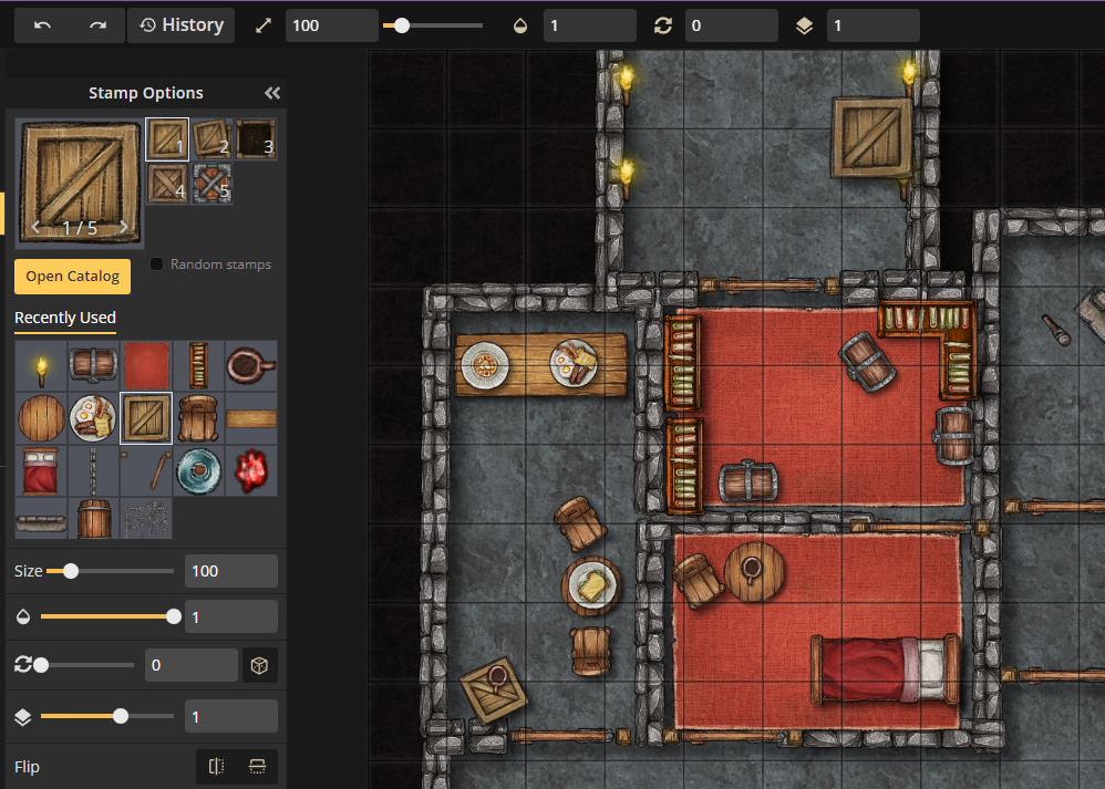
To lessen the burden of having to draw battlemaps, I found a map building tool called Inkarnate, which is often used by game masters to make maps for their Dungeons and Dragons campaigns. This map builder let me use common elements like walls, torches, doors, etc. to create maps as described by my writer teammates.
Map tool courtesy of inkarnate.com
I made one unique piece of environment artwork for each chapter of the book. To make that one piece each go further, I reduced the opacity and used the pieces as page backgrounds for the rest of the chapters. Furthermore, I slightly edited and reused portions of the art to fill blanks on other pages.
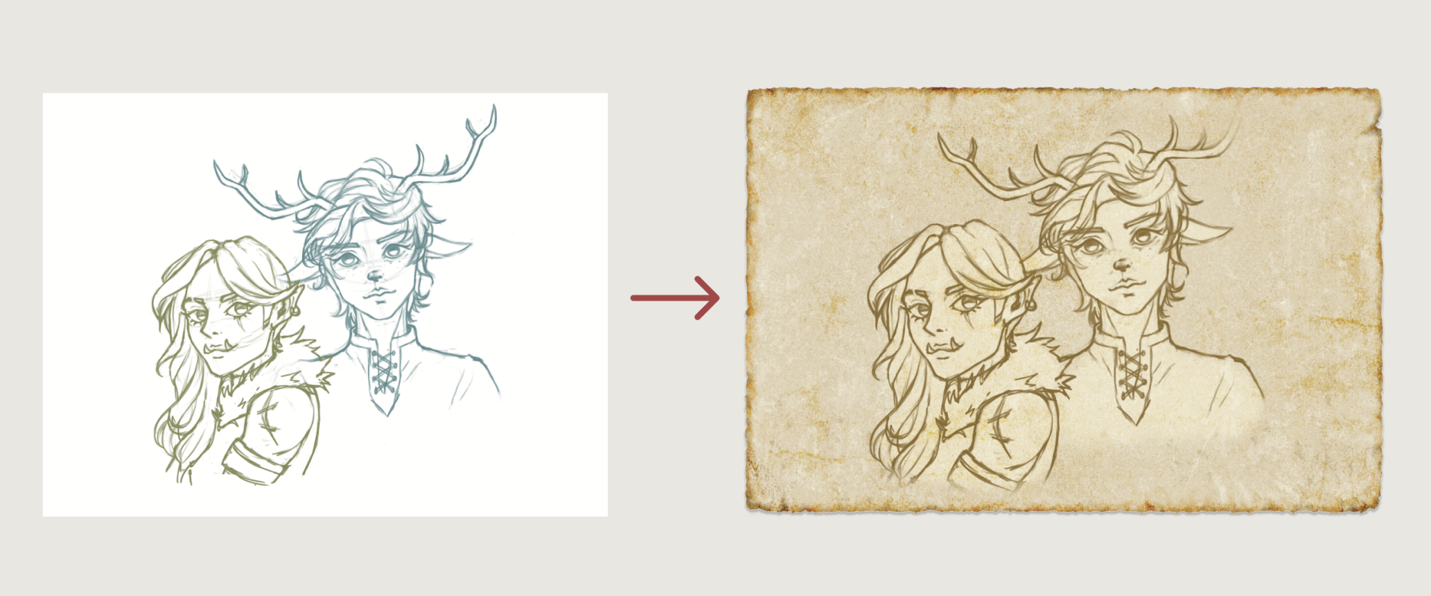
We needed a lot more character art for the character creation races, as well as Ulric, the mercenary boss. I had sketches of these characters done, but painting and rendering them out to the level of polish of my Deirdre and Bogmother pieces would be impossible given my limited time. What I needed was a way to make art faster without compromising too much on quality. I achieved this by using the sketches themselves as the artwork. By editing the colour of the lineart and putting them against a rustic, parchment background, my sketches looked like complete pieces of art that fit in-universe of our fantasy setting.
After a final stretch of book formatting and layouts by my teammates, the book was finally finished. One of my teammates managed to print and bind it as well, despite the tight timeline.
Overall, I’m very proud of the work I managed to do for this project. I was fortunate in being able to lessen the scope of my contributions without compromising too much on quality, but my mistakes taught me the importance of having a good pre-plan, as well as flexible project scope.
